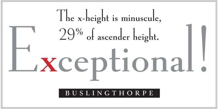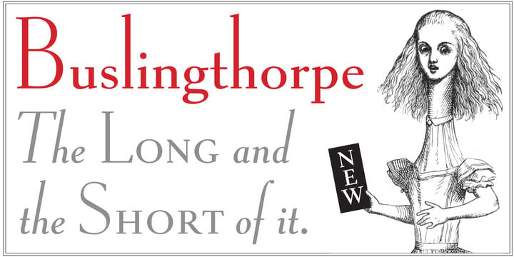
What intrigued me about Buslingthorpe was the virtuoso challenge it presented, of designing a typeface that would, despite a ridiculously tiny x-height, still possess a coherent harmony betwen upper and lower case, and read confortably. At the same time, beyond pure plastic formality, I was aware that there are strong connotations of historicism in this noble style, with overtones of regal magnificence, on account of the extravagant leading and generous point size required for adequate visibility—in traditional letterpress printing such proportions, with so few characters per square inch, were pricey and devoured resources. There are two iconic early 20th century designs in the genre: Koch Antiqua (Rudolf Koch, Klingspor Foundry, 1922) and Lucian (Lucian Bernhard, Bauer Foundry, 1925). Both these have x-heights smaller than fifty percent of ascender height, which nominally defines the category. So I made these my benchmarks, and determined to outdo them in dramatic fashion. —Nick Shinn, Orangeville, March 2021

